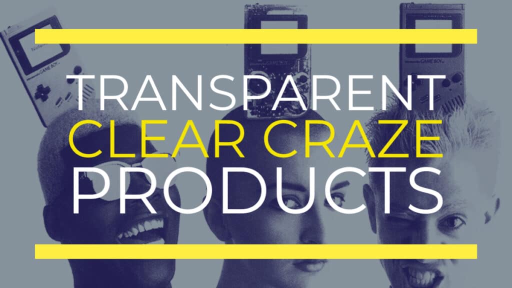
The ‘Clear Craze’ Design Trend of the 80s & 90s
For nearly 100 years, Procter & Gamble sold their Ivory bath soap by promising customers a “99 and 44/100 percent” pure product.
And for a century, it had been creamy white.
White – the universal color of cleanliness, purity, minimalism and, well… ivory.
Then, in the 1980s, Ivory soap became even more pure. Without any colors at all, transparent became the new white.
Thus, a new trend in consumer products invaded our shelves. Transparent goods came to save us from added chemicals.
No more preservatives.
No more artificial colors or flavors.
It was the wave of the future. It was the early 1990s. And they called it the “Clear Craze.”
Image via: Reddit
Where clear products went wrong
(and where they got it right)
As we learned previously on this blog, color choice has a huge impact on product design. Designers use color to help us understand what a product does and how it improves our lives.
The ‘Clear Craze’ is a perfect example of designers using product color to communicate benefits to buyers.
In the cases of Ivory soap, Gillette shaving cream, and Palmolive dishwashing detergent, clear means pure. It means clean and sterile. It means natural and preservative-free.
This message clearly connected with consumers because all of those products – nearly 30 years later – are still available and still transparent.
But when the ‘Clear Craze’ started to spread to other products, the results were more mixed.
Let’s take a look at three different uses of transparency in product design to see what went right – and wrong – and why.
“You’ve never seen a taste like this…”
On the face of it, a more natural cola sounds like an appealing product. Preservative-free. Caffeine-free. No artificial colors or flavors.
And in 1992, that’s exactly what Pepsi Co gave us.
Or, at least they tried…
As far as failed products go, Crystal Pepsi was relatively successful. After positive test marketing, Pepsi Co managed to catch 1% of all US soft drink sales in 1993. Sales totaled almost $500 million. After a fierce decade of competition with their rival, Coke, it looked like Crystal Pepsi was a shot at a different audience.
For Crystal Pepsi, transparency was supposed to mean “natural” and “healthy.” And in a market dominated by two colors (red packaging, brown product), clear was novel. For that reason, it also meant “innovation” and “excitement.”
So what went wrong?
For starters, Crystal Pepsi wasn’t all that different from mainline Pepsi cola. Sure, it was preservative-free… but so is regular Pepsi. And Crystal Pepsi used the same (artificial) flavors as regular Pepsi. Really, the only difference was the transparent color and packaging.
So while Crystal Pepsi looked like something different, the way it tasted didn’t.
Buyers weren’t fooled. They saw the gimmick for what it was. And by 1994, Crystal Pepsi was off store shelves.
Crystal Pepsi represents a total failure of Pepsi Co to understand its customers. Existing cola drinkers weren’t interested in a more healthy product. And new, health-minded customers who might’ve enjoyed a more natural soft drink only got a transparent version of what they already disliked.
This national obsession with “clarity” found its way into marketing for brands that ranged far beyond dish detergents, including personal hygiene products, and even technology such as Apple’s iMac and Nintendo’s Game Boy.
Dark Roast Media
“It looks like it’s from another planet. A good planet. A planet with better designers.”
– Steve Jobs on the Clear Craze iMac
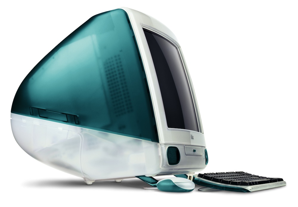
Photo credit: 512 Pixels
For Apple and other electronics of the ‘Clear Craze’, transparency wasn’t about preservatives or chemicals. It was about living on the cutting-edge.
By showing the internal mechanics of the iMac instead of hiding them behind beige plastic, Apple sought to inject some excitement into its lineup.
But where Pepsi Co fundamentally misunderstood their customers, Apple gave them exactly what they wanted.
This wasn’t a computer for your accountant. Apple wasn’t trying to sell to traditional PC buyers in office environments. It was a modern machine for the contemporary home. It was for people looking to log into the internet, maybe for the first time. And it was for kids who were learning to brave a new, digital world.
Bold color choices combined with a semi-transparent shell helped convey that their computer was different.
That’s why iMac succeeded where so many other products of the ‘Clear Craze’ failed. Apple used this design trend to help convey the benefits of their product to consumers – rather than trick them into buying hype.
“They looked like Easter eggs…”

At around the same time that Steve Jobs was presenting his first iMac, my father was testing some new colors for his ultrasonic contact lens cleaner.
Visonic Dome was being made by his company in California and sold nation-wide as ‘LenSoClean,’ bundled with a co-branded, multipurpose solution.
And it was white.
When I asked him, he couldn’t recall exactly what inspired him to try a transparent outer shell. But it’s probably fair to say that the ‘Clear Craze’ was at least subconsciously on everyone’s mind.
Two new colors were tested. The ‘Atomic Purple’ style you see above and a fully transparent version as seen here:
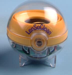
An ultrasonic contact lens cleaner seems like a perfect fit for the ‘Clear Craze.’ If transparency means “cleanliness” and “purity” for detergents, those qualities are definitely positive for your eyes.
And if transparency equals “futuristic” and “exciting” for an electronic device, then it also works for the most advanced contact lens cleaning system money can buy.
But my father never sold his design with a clear shell. And the reason is that his customer was not the contact lens wearer. He was selling to doctors.
“We sold primarily to eye care practitioners. And doctors didn’t want to show their patients something that looked like a toy.”
Imagine your optometrist or ophthalmologist recommending a better, safer way to clean your contact lenses… and then whipping out an Atomic Purple Poké Ball. Not terribly convincing.
Contact lens wearers might have appreciated the trendy new color options. But doctors wanted something that looked credible, traditional, medical. So it stayed white.
Ultimately, only a few examples were made with a transparent shell. They were used exclusively in displays at trade shows and in meetings with potential partners to show off the tech. But never seriously considered for sale.
How to make a trendy style work for your product
The take-away message to be learned from the ‘Clear Craze’ is that design trends can be great inspiration for a new product. It can also be a way to breath new life into an existing brand. But it only works in the long-term when the trend helps to convey the benefits to buyers.
Understand your customer! Know their wants and needs. Then help them get there.
Use product design to aid, not trick.
And if a new trend comes along with the word “craze” in it, ask yourself: is this a useful way to achieve the above? If the answer’s not clear, it’s best to give it a pass.