The Role of Color in Product Design
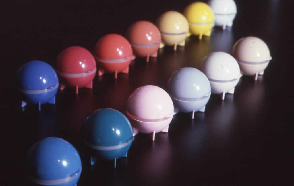
When I show my dad’s contact lens cleaner design to others, no one asks if it comes in different shapes.
No one wants a Visonic Cube or a Visonic Pyramid.
Visonic Dome is more than fine.
But plenty of people have asked about the color.
“Does it come in blue?”
“Atomic purple?“
“Pink?”
“Polkadots?”
Our emotional connection to colors – the wavelengths that make up all the different hues and shades that we see – runs deep.
Industrial designers and marketers tap into these emotional connections to make products more appealing.
And as you’ll learn in this post, product color choice isn’t arbitrary. It’s not (usually) based on the designer’s personal preferences. Product color choice is an important element in product design and marketability. And when done right, it can influence the way consumers see your product.
The “white globe with yellow stripe” Visonic Dome design is intentional.
Once you understand why, I think you’ll agree that my dad got it right.
The Colors of Emotion (and vice versa)
In their great article on the subject of Color Psychology in Marketing & Branding, HelpScout described color-emotion connections as “accurate as your standard palm reading.”
And yet, a number of psychologists over the last century have consistently found synesthetic associations between the colors we see – and the emotions we feel.
For example, here are some of the results of a study by Tom Clarke and Alan Costell for the University of Portsmouth in 2008. They surveyed students to explore the emotional connotations of different color hues.
Common Color Connotations
Red
- Passion
- Heat
- Love
Orange
- Energy
- Happiness
- Activity
Yellow
- Happy
- Cheery
- Extroverted
Green
- Peaceful
- Passive
- Comforting
Blue
- Calm
- Soothing
- Cool
Violet
- Passive
- Calm
- Feminine
Note how colors with a longer wavelength are generally described as “warm” and those with shorter wavelengths are “cool.” There’s a similar transition from colors described as “active” to those described as “calming” or “passive.”
As HelpScout rightly points out, these descriptions need to be seen within their context. Reactions to colors vary depending on where you see them and how they’re used. But the answers above are consistent with other studies on the subject.
When choosing the right color for your product, packaging, or advertisement design, it’s important to ask yourself “what does my customer want?” By understanding these common color-emotion connections, you can communicate the benefits of your product more clearly – and quickly.
Here’s an easy example:

Tylenol offers two varieties of cold+flu medication. One for use during the day and the other for night.
From the packaging design above, we can see how Tylenol effectively uses color to convey the dual benefits of their product. Blue hues communicate a soothing quality for their ‘Night’ formula, which is designed to help you sleep congestion-free. On the other hand, orange and yellow hues tell consumers that their ‘Day’ formula won’t leave you feeling drowsy.
Now imagine that same design, but with the colors flipped.
Obviously, that wouldn’t work well.
In fact, using the wrong colors could cause someone to accidentally use the wrong medication at the wrong time. We expect blue to soothe and for red to excite. Going contrary to those expectations risks confusion.
In short, colors carry their own emotional meanings and connotations. Understanding how colors are perceived can help designers meet consumers where they are and take them where they want to go.
Culturally Different? Or Universally True?
Do we learn to react to colors this way? Or are we born believing that red is exciting and blue is calming?
These are interesting questions explored by sociologists and psychologists. But they’re also questions that product designers should consider when choosing their product color pallet.
Why? Because global products might be interpreted differently depending on local color associations.
In a study published in the Journal of Experimental Psychology just last year, researchers found that most color associations seem to be universal across all cultures. Examples include the color white and purity, green and health, pink and femininity.
But certain contexts call for nuance.
In his review of colors as marketing cues across global cultures, Mubeen M. Aslam from the University of Wollongong found that while “the meanings of some colors may be pan-cultural,” it’s a good idea to research local color meanings before launching a global product.
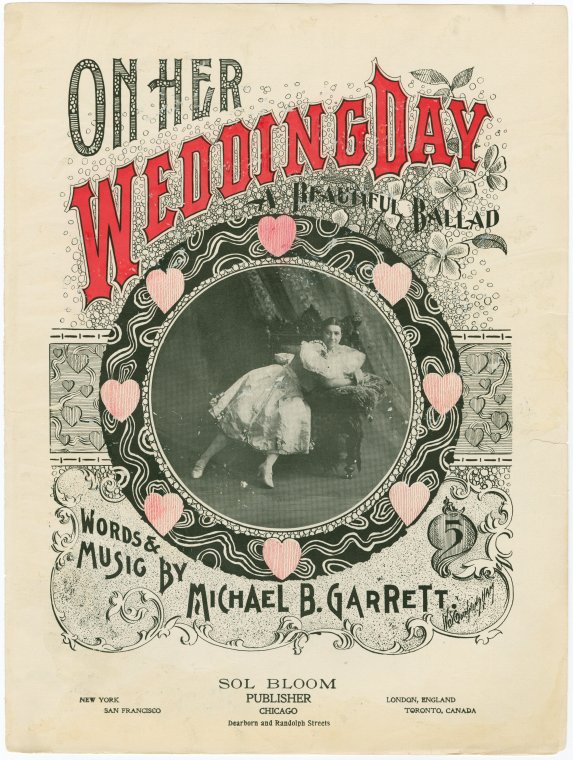
For example: in Western culture, the bride usually wears white for her wedding. Marketing material aimed at an American bride might effectively use white in their promotion.
But in China, the bride traditionally wears red. Therefore, red marketing material might be more successful with Chinese brides.
In his study, Aslam confirmed that white has a pan-cultural meaning of purity for both Americans and Chinese consumers. And red has been found to represent excitement by cultures all around the world. But certain colors hold traditional meanings that are local to specific cultures. A product that is red, white, and blue will most likely garner a different reaction in Ohio than in Vietnam.
In other words, our reaction to color seems to cross cultural borders. But it’s best to research which colors are commonly associated with your product for your target audience and follow the norms of that specific product category.
The Value of Saturation
Typically, when people talk about color they’re referring to the different hues. Red, blue, green, and so on. But think about it: there isn’t just one “true” red or one “real” blue, is there? An often overlooked aspect of product color is the role of value and chroma.
Every hue has multiple shades. And these have their own color-emotion synesthetic responses, too.
Value refers to the brightness or darkness of a color. A color with a high value is closer to white. Low value means that the color is dark and closer to black.
Chroma, on the other hand, refers to the saturation levels.
In their survey of American college students and native Mexican populations, researchers from the Universities of California and British Columbia recorded the responses to different colors. But unlike in other studies, these participants were shown colors on a scale of hue, value, and chroma.

Graph Source: The Colors of Emotion – R. D’ANDRADE, M. EGAN
What they found is that, once again, our emotional reactions to color are consistent, irrespective of cultural differences. Importantly, associations of color value and chroma seem to be similar, too.
Their findings showed that colors with high levels of saturation were most consistently described as “good” or “strong.” The least saturated colors tended to get the opposite reaction – “weak” or “bad.”
The study found that this was true no matter what the color hue was. In other words, it didn’t matter if the color was blue or red or purple. What mattered most to the study participants was the saturation and value level of the hue.
But some hues were described in more positive terms more frequently than others.
The most positive hues were from the blue/green area of the researchers’ color charts. The most negative associations came from the purple and yellow/red areas.
Why the different reactions to different hues? The answer might be that some hues have a wider range of saturation and value levels than others.
“The maximum saturation for No. 7.5 blue-green in the Munsell glossy color book is only level No. 8. This means that a chip at level No. 6 is relatively close to i t s maximum saturation. In fact, a blue-green chip at saturation level No. 6 does look like a “real” color. But a chip at saturation level No. 6 from a purple, red, or yellow region, where the maximum saturation runs from No. 12 to No. 14, does not look like a “real” color. Instead it looks like oddly tinted mud.”
To put it another way, some hues (like yellow or purple) have a more narrow range of saturation and value levels before they stop looking how we expect those hues to look. Presenting those hues outside of that accepted range got mostly negative reactions from the study participants.
“Apparently, people hold in mind the maximum levels of saturation for each hue, and find unpleasant a decrease from these local maxima.”
The Colors of Emotion – R. D’ANDRADE, M. EGAN
How to choose the perfect color for your product and brand
The results of the studies mentioned above suggest that we all react to color on an emotional level. But how can marketers and designers apply that knowledge to a product or a brand?
That is the question that researchers Labrecque and Milne sought to answer in their 2014 study, as published in the Journal of the Academy of Marketing Science.
A lot of their findings echo the color associations already studied before. The difference here is that their study focused exclusively on how people react emotionally to colors in a product and branding context.
For example, they presented fictional logos to a test group. The logos were identical in every way except for the hue.
Here’s what they found:
- The test group perceived the white, pink, and yellow logos as “most sincere.“
Orange is the “least sincere” hue. - Red is the “most exciting” hue in a branding context. Yellow and orange weren’t far behind.
The “least exciting” hue is brown. - Blue is the “most competent.” Red scored surprisingly well here, too.
Yellow is the “least competent.“ - Black is considered the “most sophisticated” by a wide margin. Pink and purple also scored highly.
Orange is the “least sophisticated” hue. - The “most rugged” hue is brown.
Purple and pink are both equally the “least rugged.”
And just like in the Colors of Emotion study outlined above, these researchers tested the emotional power of color beyond hues.
They then applied this same logo test to different values and saturation levels, too. Every logo and every hue was tested again. But this time, they tested each hue in a range of saturation and value levels. The results seem to mirror the Colors of Emotion survey mentioned earlier. Study participants rated logos that were deeply saturated as rugged, exciting, and competent. Unsaturated logos elicited the opposite response, regardless of hue.
Participants rated the logos with a higher value (lighter, whiter) hue as most sincere and sophisticated. But they also rated them as the least rugged and least competent.
Importantly, that means that the emotional connection that we have with value and saturation seems to translate into the brands and products we buy, too.
The study went on to apply this information to an imaginary brand of condoms that they tried to market to college students. If you’re at all interested in branding or color psychology, I highly recommend giving it a read.
Choosing colors for packaging material
In their fantastic study for the Journal of the Academy of Marketing Science, Labrecque and Milne identified 4 main factors for designers to consider when they choose colors for packaging and branding material. They are:
- Brand Identification
- Novelty / Contrast
- Comprehension
- Function
Blending in VS Standing out.
Shoppers stand in front of a shelf for about 12 seconds before they choose what to buy.
That means that, at retail, you’ve only got 12 seconds to convince your customer that your product is the right choice.
This requires a special balance of blending in and standing out. And that is the crux of those 4 factors mentioned above.
When consumers are loyal to a brand, packaging color needs to meet their expectations. This is brand identification. A sudden change in design can be confusing.
It’s not impossible to go against conventions. But it is expensive. Pepsi Cola spent $500 million in the late ’90s switching from a traditional red to their current blue color.
On the other hand, for consumers who are open to new options, a bold color choice can help differentiate your product from the pack. This is the novelty principle in a nutshell. And it’s exactly what Pepsi was hoping to achieve.
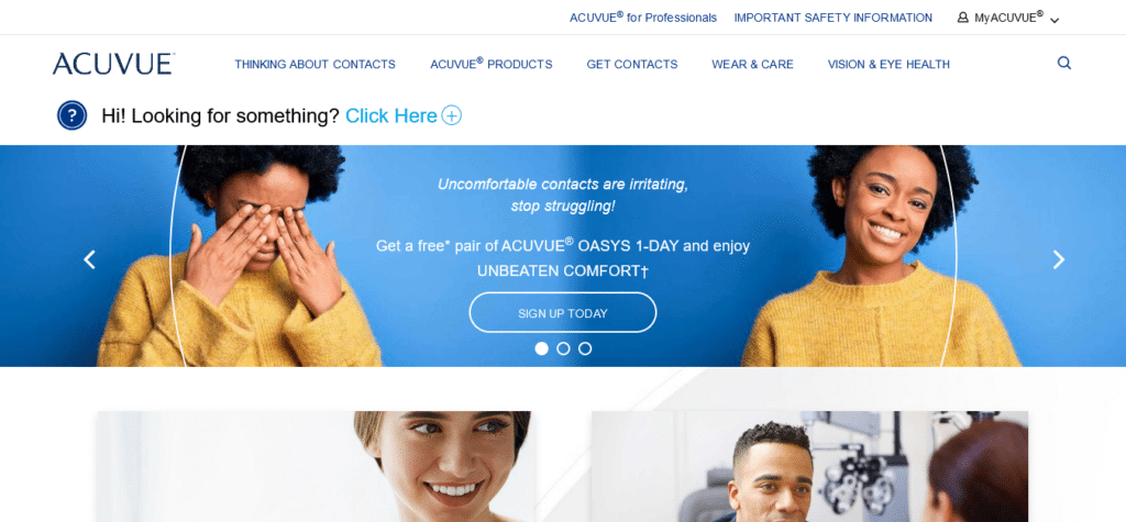
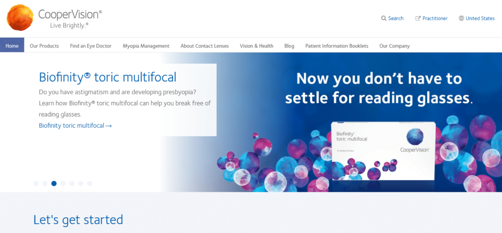
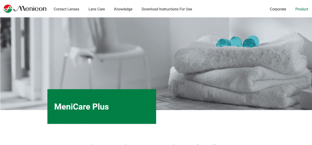
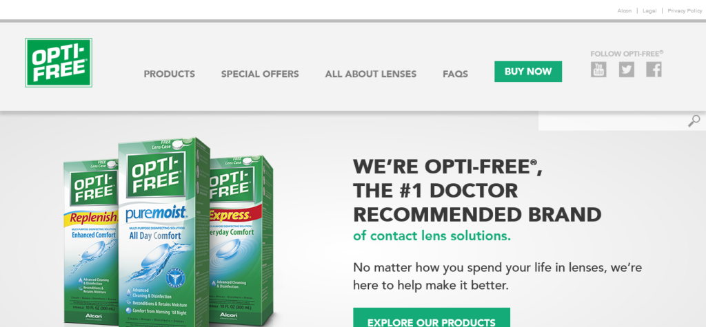
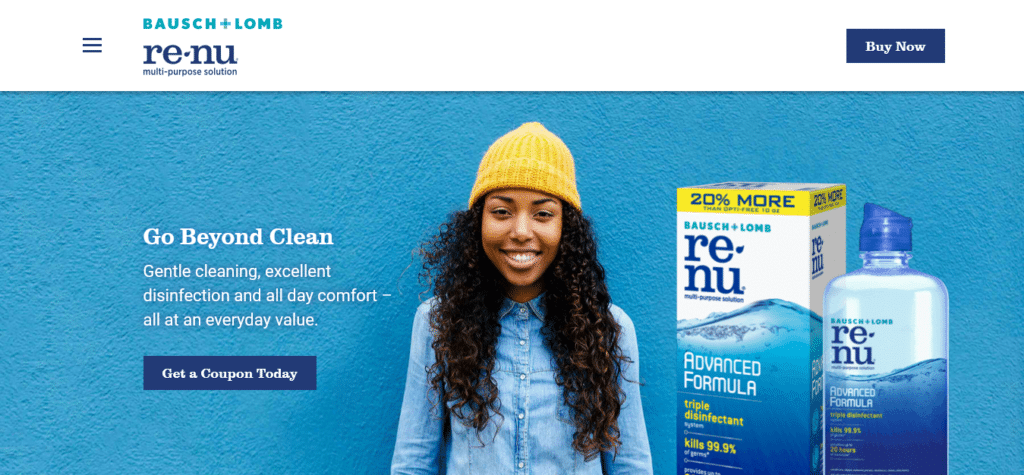
When I was first designing this very website, my dad’s words of wisdom were to use a lot of blue and green. A quick look at the homepages of other eyecare products shows that my old man’s still got it.
Blue and green hues convey messages of healing and health; cleanliness and freshness.
Notice also how basically all of those brands above also try to stand out with a contrasting splash of yellow, red, or orange.

Image source: www.sixcolors.com
Breaking The Rules
Of course, good designers always try to push their boundaries and try new things. Following the rules above will definitely help you create products that are easily understood. But going against convention can be another way to entice customers or highlight a new product.
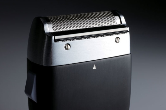
A couple notable examples are the striking, semi-transparent iMacs or the Braun SM 31 electric shaver – the first personal care product ever made in black. The SM 31 was also my inspiration for choosing black as a color option for the new Visonic Dome.
What’s your favorite color?
What do you think? Have you ever given thought to the color of products you buy before?
Keep it in mind the next time you scroll down the super market aisle. I think you’ll see things in a new light!